Showing posts with label T'sharna Bernard. Show all posts

Friday, 21 January 2011

EVALUATION; What Have You Learnt From Your Audience Feedback?


At the cinema we experienced a few technological problems when it came to showing our video , due to this our music video didn't get played; however we still managed to get feed back from the people in our class. 


Here is what I thought I learnt and what I could change if we was to do it again. 


Friday, 14 January 2011

EVALUATION; How Did You Use Media Technologies in the Construction and Research, Planning and Evaluation Stages?


This year we used Final Cut Pro differently to how it was used last year. In A2 we used more of the razor cut tool than we did before; the razor cut tool was used to edit the music video to the beat which was a very long process. 


We also used split screen which is also something we didn't use last year. we decided to use spilt screen to show emotions and both different characters at the same time. This was also done to show the concept of the video; when the girl and the keep missing each other. 


 Photoshop and Quark

I used photoshop to edit my photos that I would use on my digipak and advertisement. For instance I used the Magic Wand Tool to cut the image out of the background so that I could place it on a different background. 


This image is showing that part of the image has been selected so that it can then be copied and pasted into. below is a few screen shots showing how you do this. 


 In Quark I used the image box to import a picture then if the picture was too big I pressed command.F.4 to fit it to size. 
This is the image tool box

I also used Quark to insert text to my products as I wasn't sure if i wanted to do it on photoshop. 


EVALUATION; In What Ways Does Your Media Product Use, Develop or Challenge Forms and Conventions of Real Media Products?

We were influenced by many videos such as student work from the year before us.


The parts of the video that we was influenced by are the parts were they filmed 'the making of the making of the video', 


which is what we wanted to do; however there was a few technical problems with the lighting when we filmed so therefore we couldn't go ahead with it .But we still had a few aspects of 'the making of the making of the video' in our music video for example; 


 We used a shot with a clipboard to make it look like we was getting ready to film. This idea came from the student video we watched. 


EVALUATION; How Effective Is The Combination of your Main Product and Ancillary Texts

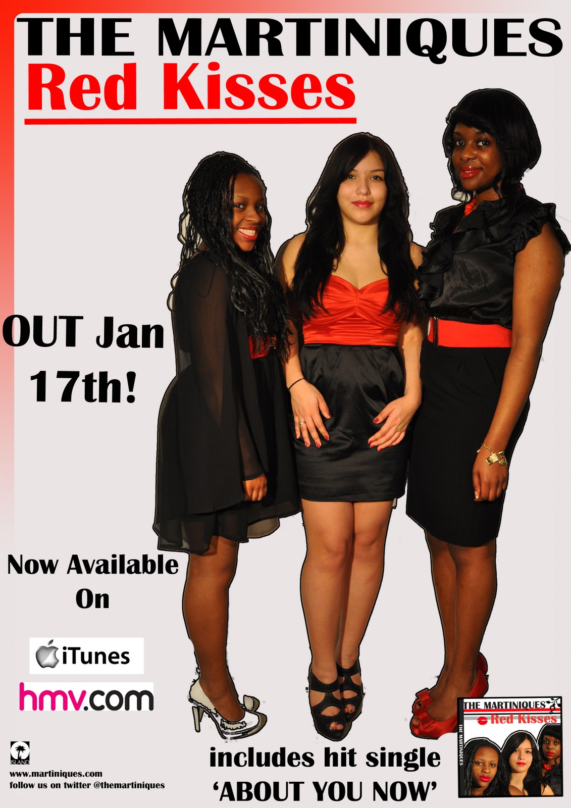
ADVERTISEMENT
FRONT COVER OF DIGIPAK


INSIDE COVER OF DIGIPAK


From looking at my Digipak and my advertisement the name of the album is 'Red Kisses' relates to the red lips on the inside cover of my digipak, which also relates to the song words 'don't let our last kiss be our last' where in our video theres a girl blowing a kiss
 

The lips and the kisses also relate to the red lipstick that the girls are wearing in the video. 


The mise en scene in the video also relates to the digipak and advertisement as the outfits are same. This was done to create continuity throughout all products. 
I also have used the same colours in the digipak and the advertisement to show a link between them both so if someone was to see the digipak in HMV and the advert on a wall outside the would know that they are together and go 'oh! I've seen that before' 


Another link between the digipak and the advertisement is the digipak cover on the advert; which makes it clearer to everyone what the products are. 

Personally I think my promotional package links well with my video as there are strong links between the two. I also think that they attract the target audience as the images on the front of the digipak are close ups of the girls faces. Which follows conventions of a girl group but it also will attracted young boys and girls who want to be like them. 

Thursday, 6 January 2011

PLANNING; Mock Up Advertistment

PLANNING; Short List of Fonts and Colours

Our group decided on using the colours Red, Black and Grey for our digipak's and advertistments but we didnt really decide on a font together. Here is a few of the fonts we wanted to use with the three different colours...


PLANNING; Short List of Images To Use For Digipak and Advertistment


Above are three images of which I plan to use on my digipak and advertistment , although I will have edited them. 
The first image is for the front cover, the second image is on nearly every panel of the digipak and the ladt image will be used for the CD

PLANNING; Do's and Dont's For Digipak and Advertistments

Do

  • Use a clear font
  • Use appropriate size for; images and font
  • Use clear photo's that are in focus
  • Use photo's that are appropriate shape for the page
  • Use a layout that follows the rule of thirds for composition
  • Use an appropriate type face that follows; genre conventions and house style
  • Be careful where you place the font. It must; follow genre conventions and be clear from a distance
  • Follow the conventions of the three colour rule, use a colour that is appropriate for; images, font and background
  • Think carefully about how you use and intergrate; font, text+language and image
  • Use appropriate industry logo's and conventions, properly positioned; barcode, date, copyright, titles and artist names
Dont

  • Stretch images; this will make them out of focus
  • Use layer styles
  • Use unnecessary effects; any effects must suit the genre
  • Place text across the artist's face
  • Use a font simply because you 'like it'
  • Feel you need a separate photo on every panel - be creative

Monday, 3 January 2011

Monday, 6 December 2010

RESEARCH; Anayisis of Three Digipaks


Pixie Lott; Turn It Up Louder

Pixie Lott's digipak can be seen as simple as only three different colours have been used pink, black and white. It has also been kept simple as only two different fonts have been used, the pink girly hand writing font is to establish the artists name 'Pixie Lott' , also that is how the artist is established everywhere else; I think by doing this is personalises the digipak and brings her personality through.
The close up image on the front cover is  there to engage her audiences and to make them want to buy it, the close up image also shows emotion. I think the image on the back cover is showing a different view to her for example the image on the front cover she looks young and just a little bit vunerable whereas on the back cover she looks strong, seductive almost as if she is calling you in to buy her album.


 Sugababes; Catfights and Spotlights

This can also be seen as simple as yet again only three colours have been used; white, beige and brown. To keep it all the same the same font has been used throughout this follows the 'two different font convention'. The artist group name is in capitals but so is the album title, but the album title is in bold so that the audience can tell the difference between the group name and the album name. There is only one image on this digipak which is a close up of the girl band. Girl groups usually depend on there image. The close up has been used to show emotion to engage the audiences.


Beyonce; I Am Sasha Fierce

From when you first look at this you can see that the artist is the main focus as she is right in the middle and her name and album title are in the left hand corner at the bottom of the panel.

Friday, 19 November 2010

PRODUCTION - Our Rough Cut


Above is our rought cut; though we had very positive feedback such as a good narrative and showing of the artist's performance, we had problems with lighting and clips which were out of focus. Towards the end of the video, some clips are out of synch yet we have beared this in mind for when we produce our final video so it will contain none of these minor yet crucial mistakes.

PRODUCTION - Screen Grabs Of The Rough Cut


Saturday, 13 November 2010

PRODUCTION - Photos From Second Session


As we have mentioned on our previous posts, we as a group have decided to film our whole music video again due to some faults from our first trial of filming such as: the dark lighting and the blurred shots from our narrative.

Here are the two slideshows that consist photos from our second trial of filming of the performance and the narrative.

As you can see, we changed some of our ideas. We used our media studio in college. We thought that it would not be time consuming and this setting is more comfortable as we are already familiar with the equipments in the room.  and used a black background, matches with the black dresses but also in contrast with the red which makes the girl group stand out. This time, we made sure that we used the lighting wisely. There were about 4 lightings across the studio which is an improvement compared to our first filming.

We used two cameras with tripods to show our idea of 'The making of the making' of our music video. We also used a black leather carpet to make the black background consistent, as the original carpet's colour is blue.

For our narrative, we did not change much, instead we filmed more shots. The setting is still in Southbank. From our first filming of the narrative, our media teacher advised us to wear something bright and eye-catching especially when we are filming outdoors with a lot of people, so that the audience will be able to recognise who they are following in the music video and so we did take this advise and decided for our actor to wear white coat and a pink/grey jacket for our actress. 

RESEARCH - Second Idea For Music Video/Previous Student Work


This is a music video made by a media group from our college a few years ago. It is very simple yet smart and good.

We really liked how they used two cameras to show 'The making of the making' of their own music video and this has given and helped us to re-create or come up with our new ideas for our second trial in filming the performance of our music video.